Implementing Navigation Drawer in Android App using Kotlin

In this tutorial we’ll implement a Navigation Drawer in our android application. Android navigation drawer is a sliding menu and it’s an important UI component. You will see navigation drawer in most of the android applications, it’s like navigation menu bars in the websites.
The navigation drawer is a panel that slides out from the left of the screen and contains a range of options available for selection by the user, typically intended to facilitate navigation to some other part of the application.
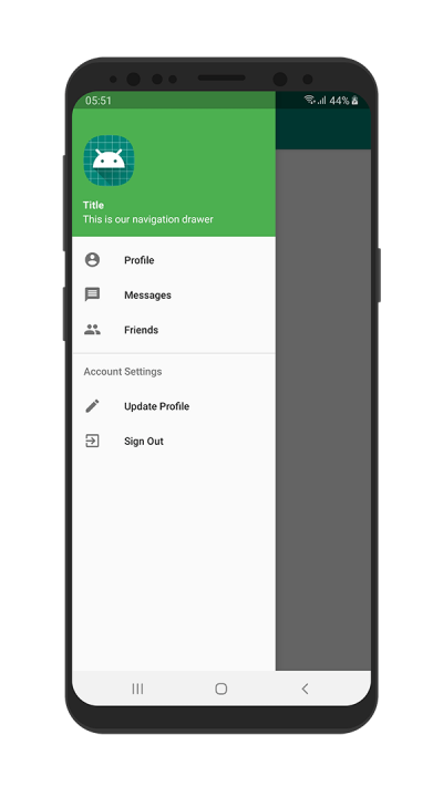
The above image shows us how a Navigation drawer looks. Also I believe that you must have faced a Navigation drawer before in other apps like Gmail, Google Play Store etc.
Why to use Navigation Drawer?
Android Navigation Drawer is a sliding left menu that is used to display the important links in the application. Navigation drawer makes it easy to navigate to and fro between those links. It’s not visible by default and it needs to opened either by sliding from left or clicking its icon in the ActionBar. Some ease of uses:
- User can view the navigation drawer when they swipe a finger from the left edge of the activity.
- If app has different destinations (more than six, say), it’s recommended to use a navigation drawer.
- It makes the app more interactive and clean.
Components of Navigation Drawer
- An instance of the DrawerLayout component.
- An instance of the NavigationView component embedded as a child of the DrawerLayout.
- A menu resource file containing the options to be displayed within the navigation drawer.
- An optional layout resource file containing the content to appear in the header section of the navigation drawer.
- A listener assigned to the NavigationView to detect when an item has been selected by the user.
- An ActionBarDrawerToggle instance to connect and synchronize the navigation drawer to the app bar. The ActionBarDrawerToggle also displays the drawer indicator in the app bar which presents the drawer when tapped.
Before you start
Create a new Android Studio project. For this tutorial, I used the name of the project “Navigation Drawer”. Also don’t forget to select Kotlin as the project Language.
Implementing Navigation Drawer in Android App
- At first, we’ll need to add a Google’s library that contains views like Navigation Drawer in our dependencies. Open the project level build.gradle file and check if
google()is added or not in the repositories.
allprojects {
    repositories {
        google()
        jcenter()

    }
}
Then open your app level build.gradle file and add dependency implementation 'com.google.android.material:material:1.0.0'
dependencies {
    implementation fileTree(dir: 'libs', include: ['*.jar'])
    //.....
    //.....

    implementation 'com.google.android.material:material:1.0.0'
}
The time I’m writing this article, version 1.0.0 is the stable version of this library. You should use the latest library always. You can find the latest library version from MVN Repository.
If you can find what are the app level and project level build.gradle files, see the image below.

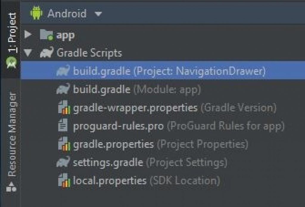
From Project Window, the first select build.gradle is your project level build.gradle file and the next build.gradle is your app level.
After you completed add these, you will see a Sync Now option came, click Sync Now and wait until your project syncs the library.
2. Now we’ll have to create some resource files that we’ll need to comple the implementation of Navigation Drawer.
Firstly create 2 layout resource file:
- content_main.xml
- nav_header.xml
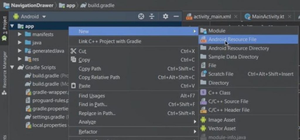
If you don’t know how to create new layout resource file then first from project window, right click on app => New => Android Resource File.
In the next popup, fill these values:
- File name
- Resource type: Select Layout
Then click Ok.

Similar way, we’ll create 1 menu resource file:
- nav_menu.xml
Just this time we’ll select Menu as our Resource type.
3. Now open your styles.xml file and add these 1 new style. You can find styles.xml in app => res => values => styles.xml
<style name="AppTheme.NoActionBar">
    <item name="windowActionBar">false</item>
    <item name="windowNoTitle">true</item>
</style>
The AppTheme.NoActionBar is for creating our own Action bar using Toolbar by disabling the default Action Bar, so we can modily our action bar design.
My styles.xml file has these codes now.
<resources>

    <!-- Base application theme. -->
    <style name="AppTheme" parent="Theme.AppCompat.Light.DarkActionBar">
        <!-- Customize your theme here. -->
        <item name="colorPrimary">@color/colorPrimary</item>
        <item name="colorPrimaryDark">@color/colorPrimaryDark</item>
        <item name="colorAccent">@color/colorAccent</item>
    </style>

    <style name="AppTheme.NoActionBar">
        <item name="windowActionBar">false</item>
        <item name="windowNoTitle">true</item>
    </style>

</resources>
Also we’ll have to use the newly added style AppTheme.NoActionBar into the activity where we’ll be implementing our Navigation Drawer in AndroidManifest.xml through android:theme="@style/AppTheme.NoActionBar"
You can find AndroidManifest.xml in app => manifests => AndroidManifest.xml
My AndroidManifest.xml has the following codes:
<?xml version="1.0" encoding="utf-8"?>
<manifest xmlns:android="http://schemas.android.com/apk/res/android"
          package="com.andrious.navigationdrawer">

    <application
            android:allowBackup="true"
            android:icon="@mipmap/ic_launcher"
            android:label="@string/app_name"
            android:roundIcon="@mipmap/ic_launcher_round"
            android:supportsRtl="true"
            android:theme="@style/AppTheme">
        <activity android:name=".MainActivity"
                  android:theme="@style/AppTheme.NoActionBar">
            <intent-filter>
                <action android:name="android.intent.action.MAIN"/>

                <category android:name="android.intent.category.LAUNCHER"/>
            </intent-filter>
        </activity>
    </application>

</manifest>
Your package name may be different this case.
4. Now clear all prefilled codes from your activity_main.xml and paste the below codes.
<?xml version="1.0" encoding="utf-8"?>
<androidx.drawerlayout.widget.DrawerLayout
        xmlns:android="http://schemas.android.com/apk/res/android"
        xmlns:app="http://schemas.android.com/apk/res-auto"
        xmlns:tools="http://schemas.android.com/tools"
        android:id="@+id/drawer_layout"
        android:layout_width="match_parent"
        android:layout_height="match_parent"
        android:fitsSystemWindows="true"
        tools:openDrawer="start">

    <include
            layout="@layout/content_main"
            android:layout_width="match_parent"
            android:layout_height="match_parent"/>

    <com.google.android.material.navigation.NavigationView
            android:id="@+id/nav_view"
            android:layout_width="wrap_content"
            android:layout_height="match_parent"
            android:layout_gravity="start"
            android:fitsSystemWindows="true"
            app:headerLayout="@layout/nav_header"
            app:menu="@menu/nav_menu"/>

</androidx.drawerlayout.widget.DrawerLayout>
As you can see, the layouts that will contain our navigation drawer must have a DrawerLayout as a parent view. our other ui design codes will be inside this. Here include tag is used to grab all the views from another layout resource file.
Thats why, to make our codes clean, we’ll put all other designs including custom action bar in our content_main.xml file.
And at the bottom of our DrawerLayout, we used the NavigationView which actually generates the navigation drawer. For using this view we implemented the library before called com.google.android.material:material:1.0.0
The NavigationView mainly contains two things, one is the headerLayout for designing the header section of our Navigation Drawer, and the other is the menu which will display the listed options in our Navigation Drawer.
For designing our headerLayout we created a layout resource file “nav_header.xml” and a menu resource file “nav_menu.xml” for creating the list options.
5. Now lets design our Navigation Drawer header at nav_header.xml file.
<?xml version="1.0" encoding="utf-8"?>
<LinearLayout
xmlns:android="http://schemas.android.com/apk/res/android"
xmlns:app="http://schemas.android.com/apk/res-auto"
android:layout_width="match_parent"
android:layout_height="200dp"
android:background="#4CAF50"
android:orientation="vertical"
android:gravity="bottom"
android:paddingLeft="15dp"
android:paddingBottom="15dp">
<ImageView
android:layout_width="wrap_content"
android:layout_height="wrap_content"
app:srcCompat="@mipmap/ic_launcher"
android:id="@+id/imageView"
android:layout_marginBottom="15dp"/>
<TextView
android:layout_width="match_parent"
android:layout_height="wrap_content"
android:text="Title"
android:textColor="#FFFFFF"
android:textStyle="bold"/>
<TextView
android:layout_width="wrap_content"
android:layout_height="wrap_content"
android:text="This is our navigation drawer"
android:textColor="#FFFFFF"/>
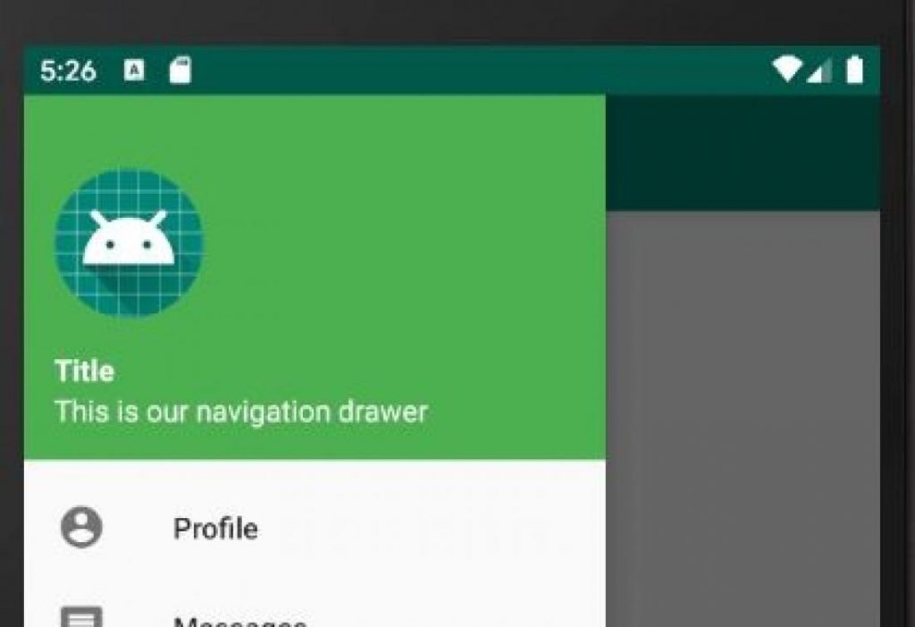
</LinearLayout>This will create our drawer header design like

Its ugly I know. You should modify the design as your requirements.
6. Now we’ll modify the menu resource file “nav_menu.xml” which will be the options displayed in our navigation drawer.
<?xml version="1.0" encoding="utf-8"?>
<menu xmlns:android="http://schemas.android.com/apk/res/android">
<group>
<item
android:id="@+id/nav_profile"
android:icon="@drawable/ic_profile"
android:title="Profile"/>
<item
android:id="@+id/nav_messages"
android:icon="@drawable/ic_messages"
android:title="Messages"/>
<item
android:id="@+id/nav_friends"
android:icon="@drawable/ic_friends"
android:title="Friends"/>
</group>
<item android:title="Account Settings">
<menu>
<item
android:id="@+id/nav_update"
android:icon="@drawable/ic_update"
android:title="Update Profile"/>
<item
android:id="@+id/nav_logout"
android:icon="@drawable/ic_signout"
android:title="Sign Out"/>
</menu>
</item>
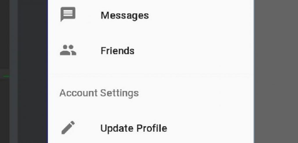
</menu>If you look at the above code, I created a menu using menu, item, and group.
menu which is the root element and it can have sub child’s/sub elements like item and group.
item which is the single menu item, we can divide/separate the menu by creating an another menu as the sub-child of item element. I also gave a title to the sub menu as ‘Account Settings’.
Also added icon with each menu item. Now this menu will cause to generate a ui like below in the navigation drawer.
The important thing here is android:icon, here you should use vector icons. To add vector icons, right click on app => New => Vector Asset
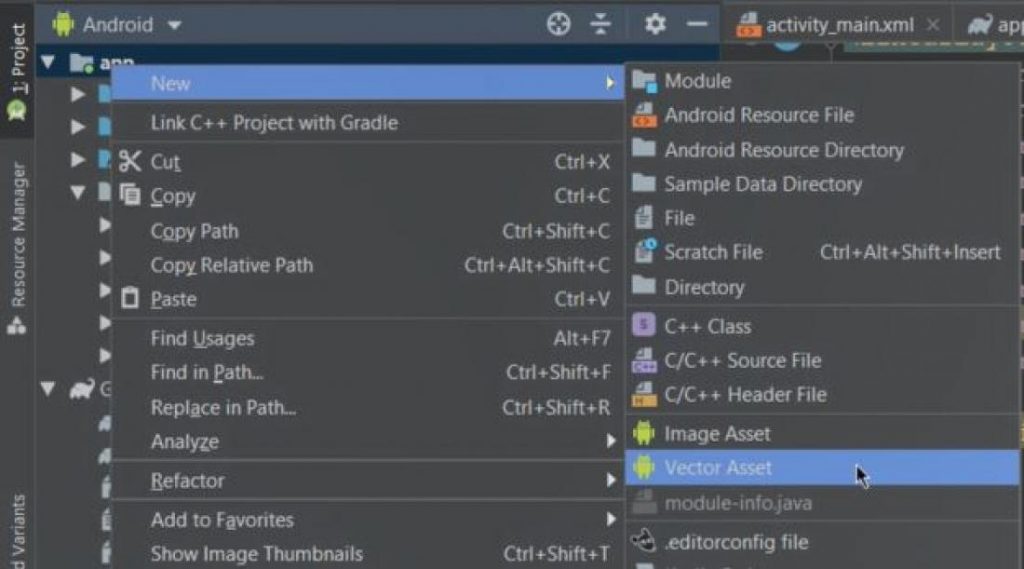
Then from the Clip Art choose your desired icon, set Name of the icon, click Next, click Finish

7. Now we will design our content_main.xml file which is the base.
<?xml version="1.0" encoding="utf-8"?>
<LinearLayout xmlns:android="http://schemas.android.com/apk/res/android"
              xmlns:app="http://schemas.android.com/apk/res-auto"
              android:orientation="vertical"
              android:layout_width="match_parent"
              android:layout_height="match_parent">

    <com.google.android.material.appbar.AppBarLayout
            android:layout_height="wrap_content"
            android:layout_width="match_parent"
            android:theme="@style/ThemeOverlay.AppCompat.Dark.ActionBar">

        <androidx.appcompat.widget.Toolbar
                android:id="@+id/toolbar"
                android:layout_width="match_parent"
                android:layout_height="?attr/actionBarSize"
                android:background="?attr/colorPrimary"
                app:popupTheme="@style/ThemeOverlay.AppCompat.Light">
            <LinearLayout
                    android:layout_width="match_parent"
                    android:layout_height="match_parent"
                    android:orientation="horizontal"
                    android:gravity="center_vertical">
                <TextView
                        android:layout_width="wrap_content"
                        android:layout_height="wrap_content"
                        android:text="Navigation Drawer"
                        android:textColor="#FFFFFF"
                        style="@style/TextAppearance.AppCompat.Widget.ActionBar.Title"/>
            </LinearLayout>
        </androidx.appcompat.widget.Toolbar>

    </com.google.android.material.appbar.AppBarLayout>


    <LinearLayout
            android:layout_width="match_parent"
            android:layout_height="match_parent"
            android:orientation="vertical">
        <TextView
                android:layout_width="wrap_content"
                android:layout_height="wrap_content"
                android:text="This is my content area."/>
    </LinearLayout>

</LinearLayout>
As you can see, we used a LinearLayout as our parent view. Which contains two other view, one is AppBarLayout which is for creating our custom action bar. and another is a LinearLayout the will be the rest of the body.
AppBarLayout is a ViewGroup, most commonly used to wrap a Toolbar, that provides many of the Material Design features. Inside Toolbar we can design our action bar now as we want.
8. Finally lets modify our MainActivity.kt to sync our designs and views of Navigation Drawer. As content_main.xml is included in our activity_main.xml file via include view, so from MainActivity.kt we can access the views of content_main.xml file.
So at first we’ll be declaring variables for our Toolbar, DrawerLayout, NavigationView and then inside onCreate() we’ll initialize them. Also as we designed our custom action bar, so we’ll need to make it supported as action bar via setSupportActionBar(toolbar)
My MainActivity.kt has the below codes:
package com.andrious.navigationdrawer

import androidx.appcompat.app.AppCompatActivity
import android.os.Bundle
import android.view.MenuItem
import android.widget.Toast
import androidx.appcompat.app.ActionBarDrawerToggle
import androidx.appcompat.widget.Toolbar
import androidx.core.view.GravityCompat
import androidx.drawerlayout.widget.DrawerLayout
import com.google.android.material.navigation.NavigationView

class MainActivity : AppCompatActivity(), NavigationView.OnNavigationItemSelectedListener {


    lateinit var toolbar: Toolbar
    lateinit var drawerLayout: DrawerLayout
    lateinit var navView: NavigationView
    override fun onCreate(savedInstanceState: Bundle?) {
        super.onCreate(savedInstanceState)
        setContentView(R.layout.activity_main)

        toolbar = findViewById(R.id.toolbar)
        setSupportActionBar(toolbar)

        drawerLayout = findViewById(R.id.drawer_layout)
        navView = findViewById(R.id.nav_view)

        val toggle = ActionBarDrawerToggle(
            this, drawerLayout, toolbar, 0, 0
        )
        drawerLayout.addDrawerListener(toggle)
        toggle.syncState()
        navView.setNavigationItemSelectedListener(this)
    }

    override fun onNavigationItemSelected(item: MenuItem): Boolean {
        when (item.itemId) {
            R.id.nav_profile -> {
                Toast.makeText(this, "Profile clicked", Toast.LENGTH_SHORT).show()
            }
            R.id.nav_messages -> {
                Toast.makeText(this, "Messages clicked", Toast.LENGTH_SHORT).show()
            }
            R.id.nav_friends -> {
                Toast.makeText(this, "Friends clicked", Toast.LENGTH_SHORT).show()
            }
            R.id.nav_update -> {
                Toast.makeText(this, "Update clicked", Toast.LENGTH_SHORT).show()
            }
            R.id.nav_logout -> {
                Toast.makeText(this, "Sign out clicked", Toast.LENGTH_SHORT).show()
            }
        }
        drawerLayout.closeDrawer(GravityCompat.START)
        return true
    }
}
Let me make the code little clear now.
ActionBarDrawerToggle is for displaying an drawer indicator in the appbar which needs 5 arguments.
- Current Activity context
- DrawerLayout variable
- Toolbar variable
- Drawer open description message via Resource string
- Drawer close description message via Resource string
I passed 0 value for both 4th & 5th, cause I dont need those. You can do by replacing 0 with R.string.open_msg where open_msg is a string item in res => values => strings.xml
Then we added the ActionBarDrawerToggle into our DrawerLayout view and synced it. Now it will display a drawer indicator in our app bar.
Also we will need to detect user’s interaction with the listed options in Navigation Drawer. for this we’ll need to implement a listener into our class using NavigationView.OnNavigationItemSelectedListener, this will allow us to override onNavigationItemSelected() function. Inside this function we can set what will happen after clicking which option. And at the bottom of the function we closed the drawer using drawerLayout.closeDrawer(GravityCompat.START)
Now Run the application and see the result. Hope everything is working fine and the Navigation Drawer is implemented. But there’s an issue still.
See that our Navigation Drawer is below our app’s status bar. But in material design, it shouldn’t be like this. So we’ll need small addition in our styles.xml to solve this issue.
To solve this, first we’ll need to create a styles.xml for v21 devices. To create this right click on app => New => Android Resource File and set the following fields
- File Name: styles
- Resource Type: Values
- Select Version from Available qualifiers and click the >> button
- Platform API level: 21

Then click OK. You’ll see that a new styles.xml file is added for v21.

Open the file and modify the codes as
<?xml version="1.0" encoding="utf-8"?>
<resources>
    <style name="AppTheme.NoActionBar">
        <item name="windowActionBar">false</item>
        <item name="windowNoTitle">true</item>
        <item name="android:statusBarColor">@android:color/transparent</item>
    </style>
</resources>
You can see that here we made our statusBarColor transparent.
Finally run the app and see that the last issue resolved.
Leave a Comment
(0 Comments)